Desert Refuge Weeks 1 and 2
Because I was down with an intestinal bug last week I will have to combine the 2 week of this project together.
In our first week, I showed how I make my sanded paper using Golden's Absorbent Ground on 1/4" form core poster board with mounted Bristol paper.
This ground is similar to their Ground for Pastel but it is a bit finer and is use to turn un-absorbent surfaces like canvases or paper that will fall apart like the Bristol paper into a surface that you can use watercolor on. I am using it so I can use use my watercolor or an alcohol wash on the Bristol paper. Like the Pastel Ground, it has an acrylic base so it seals the paper so it won't fall apart or warp when liquids are applied.
The first week after I gave the demo on how to mount the paper to the board, I talked about sketching and drawing. In pastel it is really hard to get away from either of those but they still can be a bit daunting for some but both are very important if you want to improve your painting skills.
Sketching allows you to figure out how you are going to paint your subject. It doesn't need to be anything more than a few lines or shapes on a sketch pad but it allows you to play with the elements to see how best to approach your subject. Whether you are working from a photo or working plein air, the sketch lets you get down on paper a plan, a visualization of what you want to accomplish with you painting.
Do you want it to be vertical? Or does horizontal work better? How but some to the misc. stuff that is scattered around do you really want to paint all that? Sketching lets you play with your design without having to make a commitment to it. It is also a great place to see how your light and dark values work. Don't underestimate the power of the sketch.
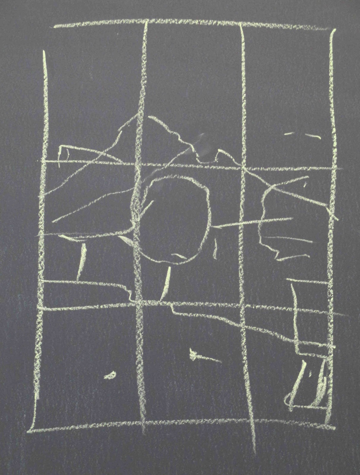
After talking about sketching and drawing, my prepared board was dry enough to get started, unfortunately, I had left my watercolor at home BUT, all was not lost, I decided that I wanted to tone my paper with an overall color of a yellow ocher and that I could do with my pastel and a little alcohol.
First I went over all of my paper with a light yellow ocher soft pastel. I want the final painting to have an overall warm, morning desert look to it and having a warm under color over all of my paper should help reach that look. Next I took a bristle brush I have in my equipment and some
rubbing alcohol you get at the drug store, and went over the entire paper. This will set the color so it won't lift off when I do apply the watercolor.
It takes a few minutes for the alcohol to dry before I could add my sketch which will be the guide for my painting. I use a light lavender pastel because it will blend in with the watercolor and the pastels that will follow.
This was the end to week one.
Week 2. I had my watercolors this time so I wanted to under paint the elements I have sketched out the previous week. Keep in mind that at no point right now am if committed to what I have sketched on my paper, it can and probably will change as the painting develops.
The first thing I did was under paint the mountain. I left the sky for now, and will get back to it when I start with the pastel (forgot to take a photo leaving the sky yellow).
Next I added some yellow ocher to the distant plains at the base of the mountain,then added color to the trees. I don't care that it is runny, if any of it shows it will be texture and color in the end.
I based in the trees with a green that had a bit of sienna in it and the reflections I added a bit of ultramarine blue. I wanted to keep things on the pale side because I want the finished painting to be more "high key" in the lighter end of the value scale.
Once the watercolor under painting was dry I started with the sky using a medium light blue at the top a light blue in the middle and a light lavender at the bottom of the sky and also I added some white to all of it before I blended.
Working down my page, I started on the mountain next with soft, warm tans and oranges, trying to keep it light. Softening edges and colors by blending.
The plains at the bottom of the mountain I used the same ocher. Remember when painting the mountain or anything that has a shape and textures, to follow the shapes and angles of what you see, they are not walls.
Colors here get a bit hard to describe because you never have the right one anyway, but I see gray greens not vibrant greens. This is not only the desert but also this image was taken in winter so nothing is really a vibrant color. There are a lot of sienna and orange in the trees and some of the bushy short trees along the edge of the path are almost a pink/lavender color. I blended very little in the trees leaving the chalk marks.
Once I got the basic colors in for the trees, I started adding more color and suggesting shadows in the trees. That is really only a medium gray green I used for the shadows and may lighten it a bit later.
I got the weeds around the trees based in with an orange rust color and that is where I left off for the class. I will continue from there when we meet again.
Keep painting and I will see you in class.
Project: Alaskan Fishing Village Week 4
In our last class we finally worked on the reflection. I left this for last mostly so I wasn't dragging my arm over it all the time.
Basically I used the same colors as I used above with the exception of the highlight colors. Reflections are a value or so darker than what they reflect and they are not mirror reflections. Water is moving all the time either from currents, tides, wind or something swimming or moving through it so there will be no straight lines or hard lines, everything will be slightly distorted. Also, you will be seeing some of the underside because water reflects what is above it and it is flat looking up, if you have any doubts, lay a mirror on the floor near a table, stand back and look in the mirror. What to you see? Same goes for the water, it is going to see what is above it like the underside of the front building and a bit more of the underside of the roof eves.

The other thing to keep in mind - and this goes along with the whole moving water thing - is to paint a reflection your strokes go in one of 2 directions: either straight down or straight across. You can make an angle, like the roof line or the rust patterns on the roof, by using a series of vertical lines. Most of the lines I used to create the reflections were vertical with a few horizontal ones usually because I was working on something small.
Now that you have the basics, I started with the green in the water, using my darkest greens along with my dark indigo blue to start, then adding some of the mid-value green for the shore grasses and a darker tone brown for the little bit of mud that shows. I put that all in before lightly blending, again my blending was straight down. When I had it blended I went gently straight across to blur the straight lines. I then added some lighter greens for lighter trees but not the real light color from above but one just a bit darker. Again, straight lines putting this color in, straight lines blending and lightly across.
The building color was added the same way, what you don't need to worry about is making it perfect especially the pilings it is standing on. If you miss a post or a board, that's okay, just blur the area a bit more. If the reflection is too detailed it will look wrong. Don't forget to blend straight down and lightly across.
Last but not least, I used my lightest blue and made a series of little marks all along the shore where the water and mud meet. There are usually rocks and sticks and whatever along the shore that can cause a sparkle as the water splashes over them, this also defines the edge of the water. Don't make it a solid line, think dots and dashes as you just skip along the shore line.
I then took the same light blue - take the paper off if your's still has paper - and on its side I very lightly went over the reflections just barely skimming the surface of my paper and I only did this once across, working my way down the reflection. This becomes the sheen on the water.
Check your house and trees to see if you need to do any more like put the rails in for the walkway in front of the red house, or add people or the boats. Highlights on the deciduous tree behind the red house, remember to follow the way the branches grow, it is not a pine tree.
This was the last day for me on this project. If you are still working on yours we still have 3 classes before the end of the semester so there is plenty of time to finish. If you have finished, bring something in that you want to work on and I can help you get started before we break for the holidays.
So keep painting and I will see you all in class.
Project: Alaskan Fishing Village Week 3
This week we worked our way down into adding the lean-to shed/garage to the main building, adding color to the red building and adding some simple detail, under painting the boats, the shoreline and the greenery around the base of the buildings.
The colors for the shed are the gray, cream and indigo for the light ans shadow. You might want to have a separate box to keep the color you have been using for a project in until you have finished it, I find it is a lot easier to find colors rather than staring into all my colors looking for what I hope is the color I am looking for.
The red building is a deep dirty red regardless of what it looks like here, it is just the contrast between the red and the green that makes it look like bright red. If you don't have a dark dirty red, use the darkest red you have and add in some burnt sienna to it (a brick color) and blend them together. I also added a person and some "stuff" in front of the building just to make it look like people actually live here. The ails cam last.
Before you get all panicky about the boat, keep in mind that it is made up with a series of shapes. The back of the boat has a curved shape, the sides are just broken lines and the cabin is a couple of boxes. I used a light gray, a darker gray, a light and medium gray/blue and the indigo, that's it. Don't over think this it is too small for much detail, it is just a shape.
The row boat again is just simple shapes, curves at the front, straight lines every place else. I used medium, warm gray, light blue/gray and indigo.
I also used that warm gray and a tan to add a shoreline around where the water meets the land, look at the photo, in the front only a little shows, in front of the red building it comes up behind the boat. Be sure that your chalk strokes follow the direction of the slope of shoreline.
The grasses and the bushes have a light yellow green, a medium yellow green and a dark blue green for shadows and some light sienna in it as well. I used the lither greens to blend into the darker green of the bushes using a scumbling (all directions) stroke, while I used a more vertical strokes for the grasses. Don't be afraid to pull the grasses up around the bottoms of the pilings and the boats, that will settle those things down into the grass.
Next week we will work on the reflections and final details of this painting so try to have yours to this point, we - I - may finish this in our next class.
See you all in class.
Pastel Project: Alaskan Fishing Village Week 2
The first week or our project we did an alcohol and charcoal under painting. This established our dark areas and some of the middle grays. Last class we started adding color.
Just a note here: Some of the dark charcoal may show through and that will be a good thing. That dark becomes the deep dark shadows of the forest and other dark shadowed areas so it isn't necessary to cover it all. Let it work for you.
The first thing I did was to add in my sky colors. While I didn't want the gray, gloomy day the photo was taken, I also didn't want a bright blue sky. this is my personal preference, if you want your sky brighter, that is up to you but there are things to remember when painting skies - Skies are darker as the go up from the horizon so use your darker colors at the top and lighter colors as you go down. I used a mid value gray/blue and a very light blue and blended them to get what I hope is a clearing sky color.
You will have to paint around the tree branches but this is also a time where you can reshape your trees if you got them too solid or if you need sky holes. Remember to look at the photo to see how lacy the tops of the trees are and how they vary in size and shape.
The branches of the trees have about 4 different colors of green from very dark to a mid value color. Remember, these are the ends of the branches of the trees that are in the light, leave some of the dark and be very sketchy with your strokes so it looks like branches coming out from around the tree not just the sides.
There is a deciduous tree behind the red building that is a bit brighter, lighter green. Be aware that the branches come out from the trees a bit different and it has a very different shape.
I got started on the brown building using a cream color, an indigo (dark gray/blue), a light sienna and a darker sienna and the gray/blue from the sky. the key thing here is to be aware of the direction things are going. the roof slants down, follow the slant. The boards on the side of the building and the top of the front are horizontal, but the lower half of the front is vertical. I lightly blended parts of these colors but tried not to blend too much. For the lines of the boards, I used the indigo because it is a harder pastel, you can use a dark pastel pencil or other cool dark pastel .
This is where we left off but I do want to note that when I got home and was looking at the photos, I realized that the back part of my roof is too high, I will fix it in class so you can see how I fix something I don't like.
Keep painting and I will see you in class.
Project: Alaska Fishing Village Week 1
The first thing I showed was how to get the design on my paper using what I call "poor man's transfer paper" by applying chalk to the back of my design, then going over the lines with a pencil or the end of a brush to transfer the design to my paper.
Usually I use a color like a light blue or purple so I won't have problems when I'm working my painting but because I am going to be doing an alcohol wash over charcoal, I just used the charcoal for this step.
Once I got the design on my paper - I am using sanded Bristol paper mounted on foamcore that I made myself - I wanted to do a rather loose value under painting using black (charcoal) to get my trees in and to establish some of the values (light to dark) of my painting.
When I was doing the trees I was trying to keep the spaces at the top edge of the trees and suggesting tall and short trees. These are not Christmas trees, they are not perfect, they are not all the same height. These are things you need to keep in mind as you work.
The closer to the buildings I got the more I tried to cover the paper so I could get a dark background. On the right, there is a lighter tree so I did leave it blank.
In the water, I pulled the charcoal straight down going around the reflections of the buildings.
In the buildings where I wanted a little bit of a value change, I lightly skimmed the paper with the charcoal so there was only a little color to move around in the next step.
The next step is using rubbing alcohol to set the design onto my paper. This is just plain rubbing like you get at the drug store, nothing special, I used my watercolor brush to apply it to my paper.
I went over everything that I had charcoal on to set in so it won't come off as easily when I go to paint, this also establishes your dark values of which there are many in this project. Where I needed just a little color I used what was on the brush to do parts of the houses and roofs.
This is where we finished in class, try to get you paintings to this point before next class.
keep painting and I will see you in class.
Project: Apple Turnover Revised Week 6
 Last time I mentioned that I had a couple things I wanted to do before calling my painting finished so here they are. First, I wanted to bring some of the background leaves down behind the table so it would look more natural. As you can see the previous image from last week the leaves look like they are avoiding the table in a nice little semi-circle around the corner of the table, on the left, a few extra leaves and problem solved.
I also wanted to add a couple more leaves to some of the apples but only did one. By adding a leaf to the apple on the left side and overlapping the basket, I tie the apple to the basket visually as well as create a better sense of depth, the leaf pushes the basked back just a bit.
Finished project for now. I do like to live with a painting for a while just to be sure that when I can look at it with fresh eyes nothing jumps out at me but overall, right now I am satisfied with the outcome.
Because what I had to do took all of 5 minutes - if that - I did a demo on how to create your own sanded paper by using the Ground for Pastel by Golden. There may be other manufactures with their own product but I use Golden.
It is a simple procedure and takes a bit of time, but in the long run you can save money and have more versatility - in my opinion - than constantly using manufactured sanded paper.
I do want to say, that this is my opinion regarding, not just making the sanded paper but also, using sanded paper. Every artist has their preferences and it is up to you as an artist to explore your options and find out what works for you. I had used regular pastel paper for many years and was satisfied with the results but once I used the sanded paper I was hooked, mostly because I didn't like having to spray it with workable fixative all the time. Again, this is your preference.
The first thing I did, and this is something I just recently learned from attending a Pastel Society meeting, was to mount the paper to a support, in this case some foam core presentation board that I got at the local drug store (you can also find it at office supply stores and art stores, just be careful that the sheets are not near the party stuff with all the glitter or you will never get rid of it). You can use any kind of paper you want, from pastel paper to watercolor paper to mat board to whatever is handy, I was using Bristol paper because it is a heavy paper as well as having a smooth surface.
I cut the foam core down to a size that was a bit larger than my paper then I used and archival spray glue (Scotch Supper 77 but there are other spray glues that will work as well) to mount the paper to the foam core. Smooth it down well so that there is good adhesion between paper and board and to be safe, let it dry for a few minutes. I was rushed to get the demo done before people had to leave but would have let it dry for several minutes otherwise.
Next, I mixed up a combination of the Ground for Pastel and water. I usually use about a 3 to 1 ratio (3 water to 1 ground), this is an approximate measure, you want a thin slurry of the ground. This will give you a smoother surface and you can go over it a second or third time if you need more texture. Yes, you can use it right out of the jar but you will get brush strokes showing, which is okay if that is the look you are going for.
I was using a flat bristle brush that you would use in oils or acrylics but I have used softer brushes when I am doing this at home. The key is to use a big brush so it will go on quickly and smoothly. I try to first get some of the slurry on the paper then with lighter pressure on the brush, spread and smooth out the ground while it is still wet. This will help prevent lumps and missed areas as well as giving you a smooth surface. Let it dry.
When it has dried, feel the surface to be sure that you have an even coat of ground and if it feels like it has enough "tooth". If it feels like it needs more, repeat the above.
This ground will go onto almost any surface that it will stick to so feel free to experiment once you get the hang of it.
We have one more class to finish up or to look ahead to new projects. Keep painting.
Project: Apple Turnover Revised Week 5
When I started out the class, I thought I had one more session after that class to finish up the project, but as I got closer to the end of class I realized that I was basically done! Surprise! Surprise! This happens with most paintings, you get to a point where you are circling the painting with either brush or chalk and looking for a place to land, that is usually the best place to stop at least of a couple of days then look at it with fresh eyes. This will keep you from over working a painting and ruining what was making it work.
When I got it home, I found a couple places I could improve but these things are minor and won't take more than a few minutes. If you are to that point in your's of if you just feel a bit frustrated, set your painting aside for a while, you can always come back to it if you want.
I started the class by adding shadows. Shadows are always darkest closest to the object that is casting them and get lighter as they get further away so most of my color was near the bottom of the apples or basket where they touch the table and I blended the color out from there. I also lightly blended the bottoms of the apples as I was blending the shadow on the table to give a "lost and found" look to the apple. I was using a dark indigo which is a dark blue/gray.
Once I had the shadows on I went back in with light colors for the table to add more light around the shadows and the apples.
After I had gotten the shadows and the table where I wanted them, I decided to breakup that big area of negative space behind the table with some branches and leaves.
I used a teal color for the leaves and brown for the twigs, and just quickly based in the shapes of the apple leaves. You don't need to be too exacting at this point because the leaves are not the focal point of the painting they are there to make that area less obvious. This is one of the areas I need to work on in class next time, see if you can figure out why.
This is about midway through the class. I have my shadows in and more table highlights and I am starting the leaves in the background. I also used a lighter indigo to add shadows to the table from the leaves.
Next I have to start adding the highlights on the apples and final touches on the basket.
The highlights on the apples have a couple of steps. The parts of the apple that are in the light but do not have the light spot can be lightened using a light orange color. If you try to use white, you will just turn your red apple pink. On the green apples, you can use yellow.
This is for the overall color in the light areas. Look at the reference photo and look at the areas around the bright spot, that is the area I'm talking about. Follow the direction of the apple so you can keep the curves of the apple, it is easy at this point to make them look flat by using straight strokes either vertical or horizontal so be mindful of your strokes.
Once that part is done, now comes the bright spot. You can use white if you don't have a very light cream color (being a bit on the yellow or orange side will make it look warm, white is a cold color). LOOK at your photo to see where the bright spot falls on each apple, add that warm white or white to that area then lightly tap the color you just put down. This will soften and blend the color and the edges. Then use pure white to the very center of this spot you made and leave it alone, do not blend. Do this for all the apples that the sun is hitting. You will be doing very little blending at this point.
I added a few stems to some of the apples and a leaf to one in the basket. Look for places you can add detail like the tops and bottoms of the apples to suggest the direction they are facing. Finishing up a painting is personal so do as little or as much as you feel comfortable with (I can get a bit overboard).
Don't forget your basket at this point. Be sure you have highlights where you need them and that you have followed the weave of the basket, this is important so you get the twist of the handle and the texture of the weave of the basket.
I brought the leaves across the page and behind the basket. I also took a darker version of the first color - you can use the indigo or a blue if you don't have a darker color - to add some suggestion of shadows and shadowed leaves as well as some of the apple green to suggest apples on the branches.
Last, I took a light blue and hit some of the edges of the leaves with this color to help separate some of the leaf shapes from others and to highlight a few of the leaves. Don't get carried away adding detail to this area it isn't the focal point and too much busy work can draw the eye away from the apples.
This is where I stopped in class because I was looking for something more to do and couldn't find it. As I said at the beginning once I got it home I fond a couple places I think I will touch next class but basically I could call it done at this point.
You do not have to get your's done by next class we still have a couple of weeks before the semester ends so if you are still working on you project take the time you need. If you are finished, bring in something else to work on and I can help you get started.
Keep painting and I will see you in class.